Gruet Winery Rebrand: French Roots in the New Mexico Desert
Gruet Winery has a unique background, combining French winemaking traditions with its current home in New Mexico. The Gruet family started their winemaking in France in 1967 before moving to the U.S., where they became known for their award-winning still and sparkling wines.

THE CHALLENGE
Create a visual identity that authentically balances the elegance of French winemaking with the distinct natural beauty of the American Southwest


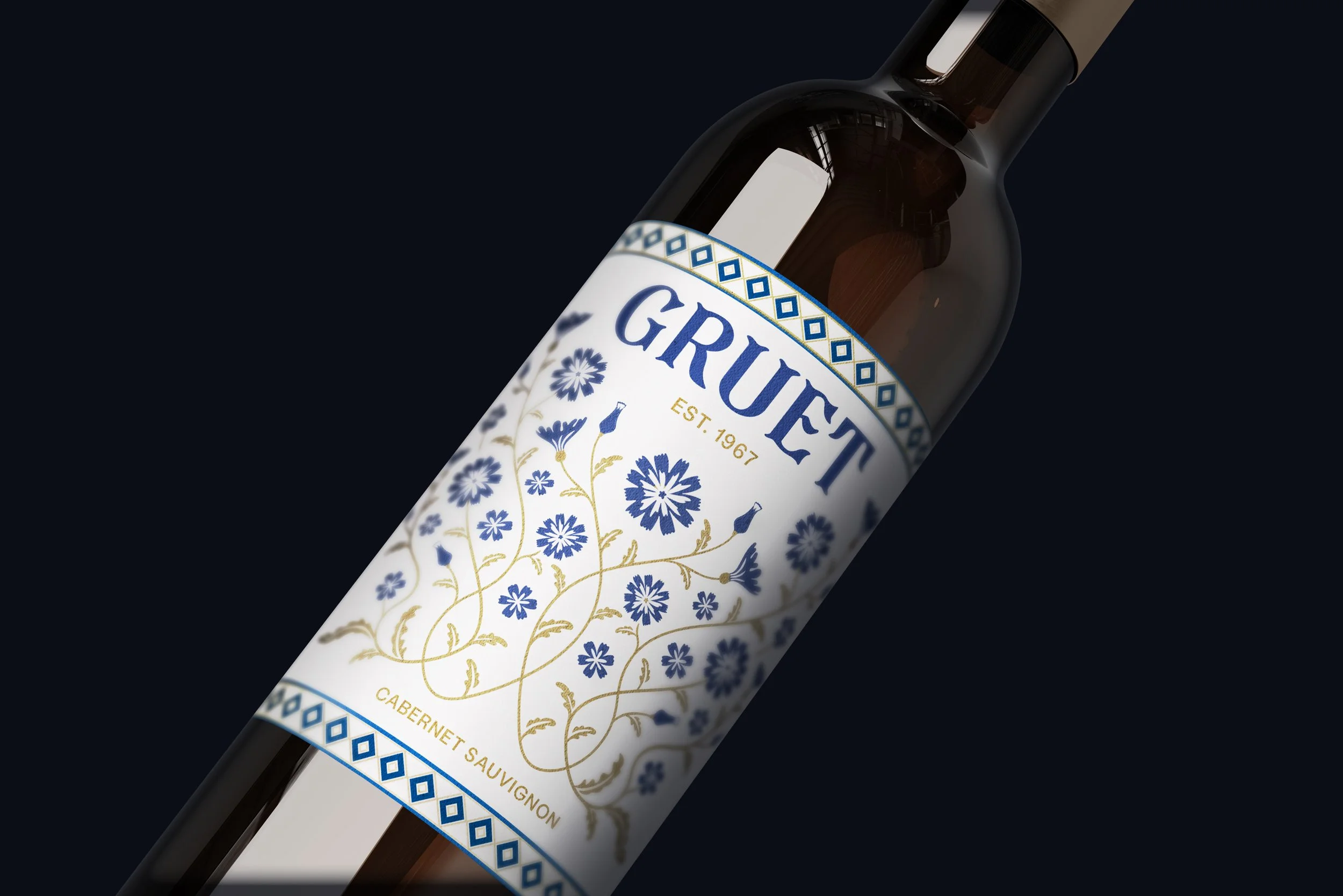
REFRESHING THE LOGO
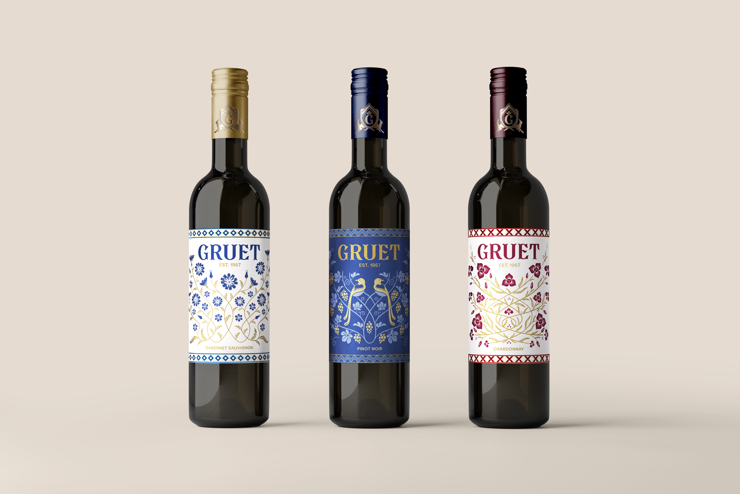
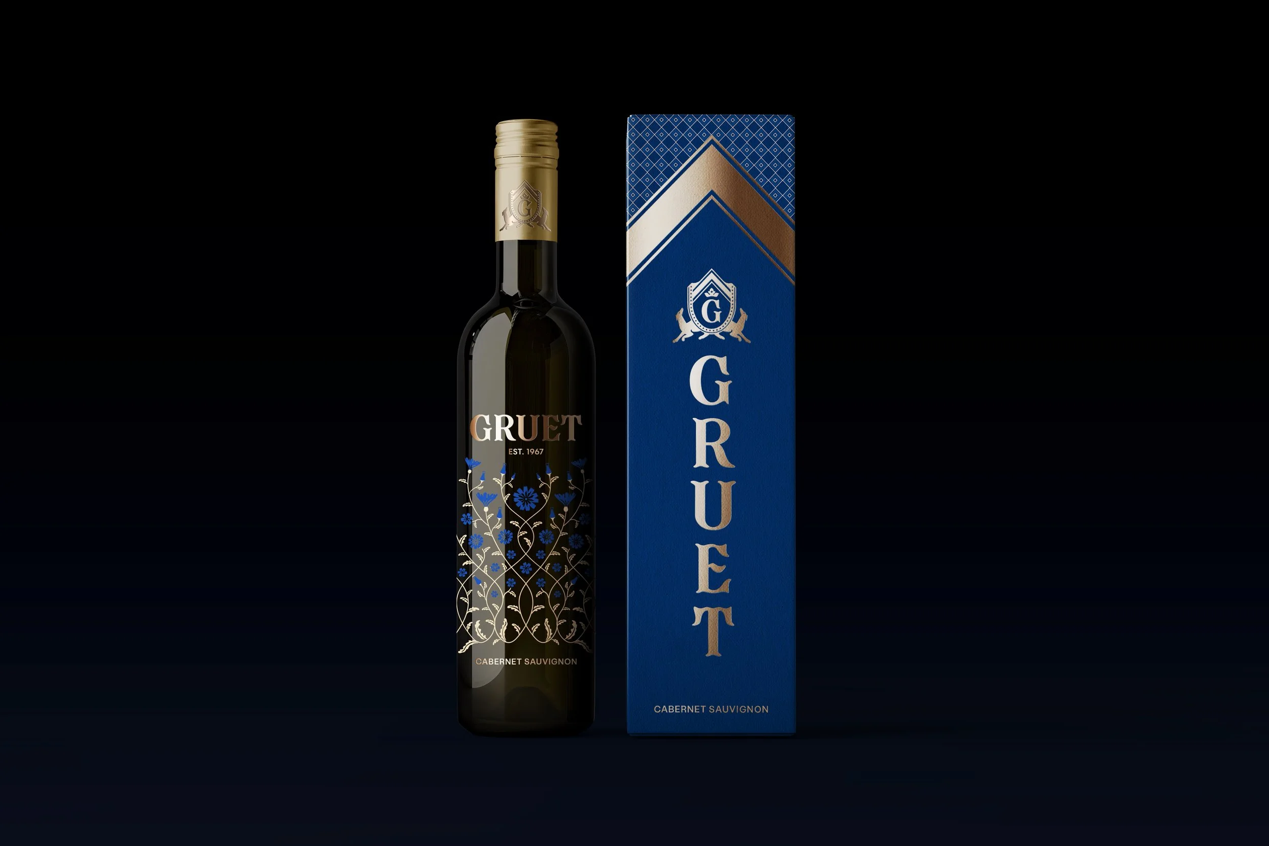
I designed the wordmark with inspiration from classic French typography, reflecting their deep-rooted winemaking heritage. Instead of a complete redesign, I refreshed Gruet’s existing logo, preserving key elements like the hounds, ribbon, and amphora, which are the symbols of their family-owned business and historical significance.

PACKAGING INSPIRED BY LOCAL NATURE
To connect the packaging to New Mexico, I studied local flora and fauna, using native flowers and birds as inspiration for intricate patterns featured on the labels.